Categories
Code Snippets

Remove PHP Mail Special Characters in Subject Field

Let’s say you’d like to insert special characters in the subject of HTML e-mails sent with the PHP mail() function.

You have an email subject which when extracted from my database looks like this..

Coffee & Laptop

Sample code..

$to = 'me@example.com';
$subject = 'Coffee & Laptop';
$message = 'HTML message...';

$headers = 'MIME-Version: 1.0' . "\r\n";
$headers .= 'Content-type: text/html; charset=utf-8' . "\r\n";
$headers .= 'From: Me <me@example.com>' . "\r\n";

mail($to, $subject, $message, $headers);

Ofcourse, you won’t want the &amp; symbol showing when the email is sent to your client.

Add this line to change the html entities to the proper values:

$subject = '=?UTF-8?B?'.base64_encode($subject).'?=';

Your code becomes:

$to = 'me@example.com';
$subject = 'Coffee &amp; Laptop';
$subject = '=?UTF-8?B?'.base64_encode($subject).'?=';
$message = 'HTML message...'; 
$headers = 'MIME-Version: 1.0' . "\r\n"; $headers .= 'Content-type: text/html; charset=utf-8' . "\r\n"; $headers .= 'From: Me <me@example.com>' . "\r\n"; mail($to, $subject, $message, $headers);

Here’s what the end user sees as the subject when they receive the email:

Coffee & Laptop

Categories
Blog Code Snippets

CSS Media Queries for Mobile Devices

Writing CSS for different devices can be a pain in the ass. With Media Queries it’s easier, if you know how to pin point a specific device.

This can help you pin point a specific mobile device from within your CSS. Copy the code and paste it into you CSS file and get crackin’!

/* Smartphones (portrait and landscape) ----------- */
@media only screen
and (min-device-width : 320px)
and (max-device-width : 480px) {
/* Styles */
}

/* Smartphones (landscape) ----------- */
@media only screen
and (min-width : 321px) {
/* Styles */
}


/* Smartphones (portrait) ----------- */
@media only screen
and (max-width : 320px) {
/* Styles */
}


/* iPads (portrait and landscape) ----------- */
@media only screen
and (min-device-width : 768px)
and (max-device-width : 1024px) {
/* Styles */
}


/* iPads (landscape) ----------- */
@media only screen
and (min-device-width : 768px)
and (max-device-width : 1024px)
and (orientation : landscape) {
/* Styles */
}


/* iPads (portrait) ----------- */
@media only screen
and (min-device-width : 768px)
and (max-device-width : 1024px)
and (orientation : portrait) {
/* Styles */
}


/* The New iPad (iPad 3) ----------- */
@media only screen
and (min-device-width: 1536px)
and (max-device-width: 2048px)
and (-webkit-min-device-pixel-ratio: 2) {
/* Styles */
}


/* iPhone 4 ----------- */
@media
only screen and (-webkit-min-device-pixel-ratio : 1.5),
only screen and (min-device-pixel-ratio : 1.5) {
/* Styles */
}


Categories
Blog

Your Desktop Site Will Look the Same!

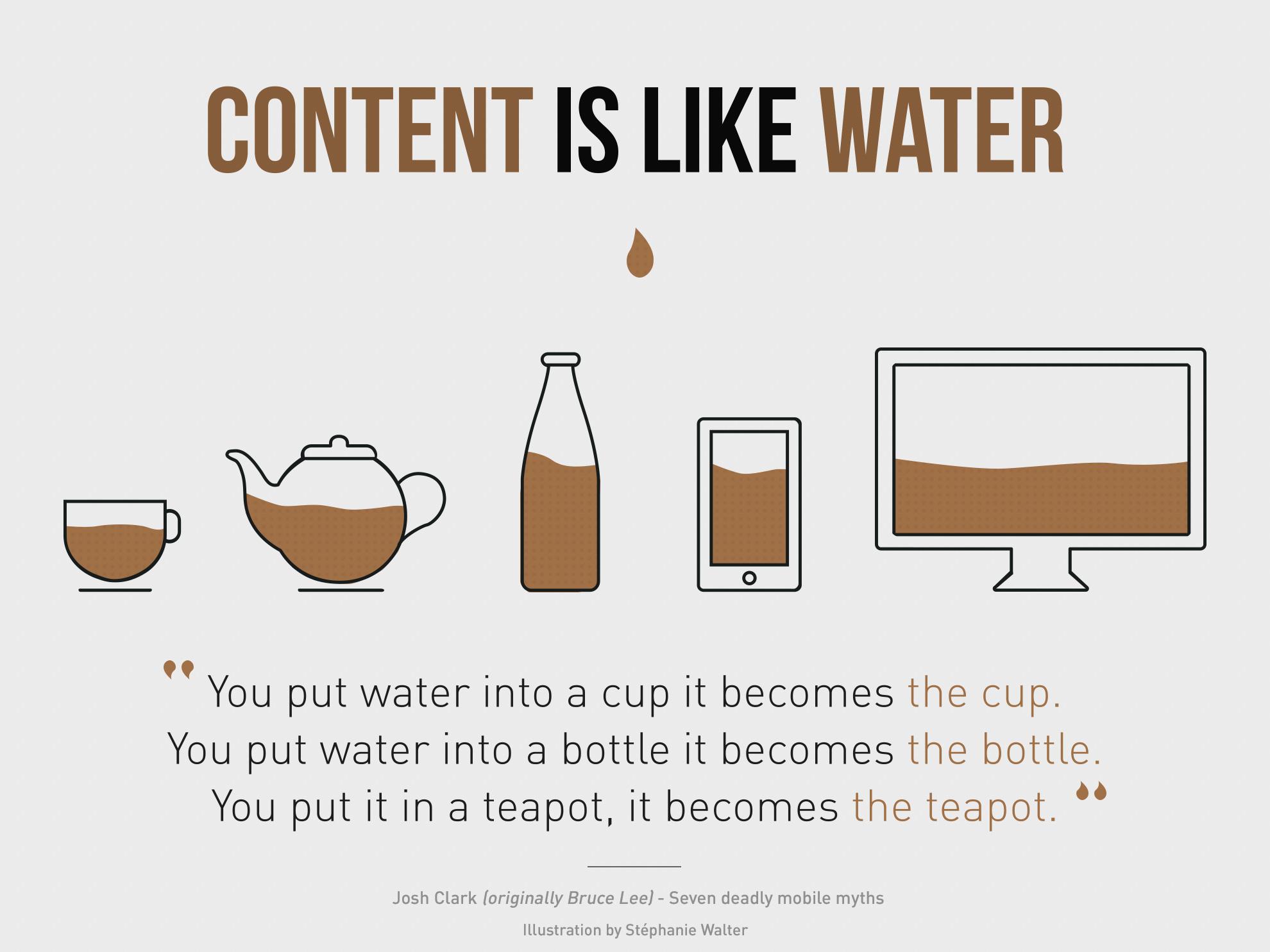
I often receive requests from potential customers on making their website ‘mobile friendly’ or ‘mobile responsive. ‘Mobile responsive’ means the webpage reacts to the size of the device its being displayed on. In other words, a mobile responsive web page viewed from a tablet will look differently when viewed from a mobile phone. That’s because the two devices are extremely variant in size, and as a result, your web page should work to suit.

Responsive web design is an approach to web development aimed at crafting sites to provide an optimal viewing and interaction experience; easy reading and navigation with a minimum of re-sizing or panning, across a wide range of devices (from desktop computers to mobile phones).

Responsive Web Development

Multiple columns won’t fit on a mobile phone. They’re usually collapsed into one column; one flowing after the other. Also on mobile devices, horizontal navigational menus become hidden and is shown by toggling on a menu button. The mobile menu button becomes fixed to the same location so that when site visitors scroll down on the page, the menu button is always visible. That way, they won’t have to scroll back up to the top of the page to access the navigation.

Each of these changes are necessary to maintain usability and aesthetics from a mobile device. These are the types of changes which my clients can expect when they ask me to make their site mobile responsive.

However, many of hesitant as they’re afraid of the impact on the existing desktop version of the site. I can assure you; the look, theme and functionality of your desktop site will not change in any way. The changes which I make are using CSS styling code only and will only apply on mobile devices and smaller browser windows. The desktop site remains exactly the same.

Take a look at your site using a mobile device. Are you happy with the look and function? If yes, wonderful! Your web developer did a great job. If not, contact me and I’ll make it awesome!

Categories
Blog Code Snippets

Vertically Align Anything with Just 3 Lines of CSS Code

Have you to vertically align an element and it just won’t work.

vertical-align: middle; claims to do the trick but it won’t apply to every situation.

.element {
  position: relative;
  top: 50%;
  transform: translateY(-50%);
}

That’s all you need! It works straight out of the box, even in Internet Explorer 9.