Categories
Blog Code Snippets CSS

Ugly Form Fields on Mobile, particularly Select Field and Submit Buttons

Are you experiencing ugly form fields on the mobile devices which look nothing like the very cool and awesome fields which you built for the desktop version? That could be because its using the browser’s default css for the input and select fields and buttons.

I’ve experienced this on my iphone but it could happen with other mobile operating systems and browsers also.

This bit of code will eliminate that effect.

input {
    -webkit-appearance: none;
    -moz-appearance: none;
    appearance: none;
}
Categories
Code Snippets CSS

Install a font file using css: otf, ttf, woff, etc.

First step: upload the .otf to the server so its accessible by the css file.

Add this bit of code to the top of your css file to activate a new font using its .otf file.

In this case, the .otf file was placed in the fonts folder on the same level as the css file.

@font-face {
  font-family: 'Arial';
  src: url('./Arial.eot');
  src: local('Arial'), url('./Arial.woff') format('woff'), url('./Arial.ttf') format('truetype');
}

Here’s how to use that newly added font. The font name below must be exactly the same as the defined “font-family” name above.

body {
  font-family: 'Arial';
}
Categories
Blog Code Snippets CSS

Smooth Transitions

Add this bit of code to ensure smooth transitions of elements:

* {
  -webkit-transition: all 700ms;
  transition: all 700ms;
}

This will apply to all elements and for all types of transitions; whether its related to the element’s height, width, positioning or font size.

It is especially useful for mobile responsive when the element size has to be made smaller to fit the device. By using this smooth transition, the change looks smooth and nice to the end user.

Categories
Code Snippets Wordpress

Customize any Form on WordPress using CSS

Have you installed a contact form plugin for WordPress and found the default layout is entirely boring?

I’ve been there! The default layout comes with a very little or absolutely no css formatting.

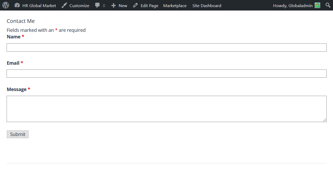
Below is the default layout for Ninja Forms.

Contact Form - Before Applying CSS

Luckily, I was able to write a snippet of code which will resolve that.

The Solution to Customizing any Form on WordPress using CSS

This snippet can work on any contact form for WordPress; including of course Contact Form 7 and Ninja Forms. Just copy and paste into your custom css editor. Some themes will come up with this editor which you can find in the WordPress Admin section under ‘Appearance’. If your theme doesn’t come with it, download and install Simple CSS and JS which will work perfectly well.

input, select, textarea {
  border-radius: 3px;
  color: #666;
  font-size: 17px;
  padding: 8px;
}


/* Reduce the textarea size to 80 pixels */
textarea {
  height: 80px;
}


Contact Form - After Applying CSS

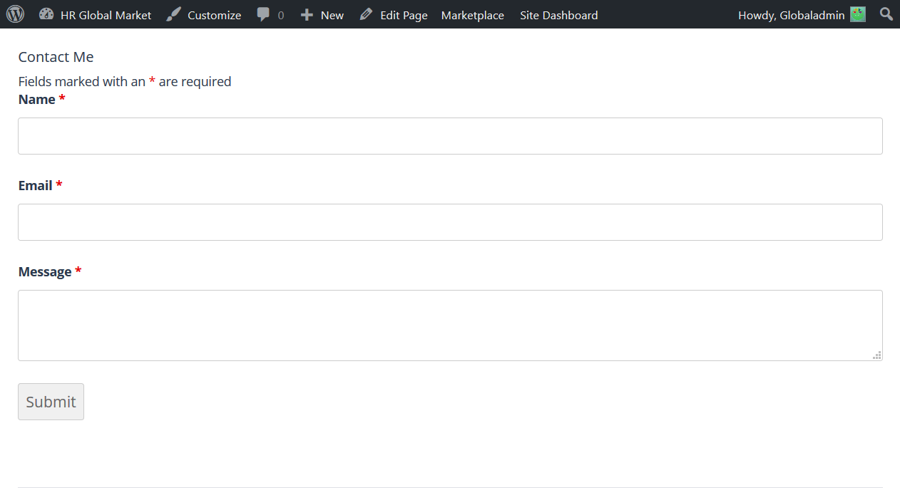
There you have it! A nice sleek modern looking form created by adding just a few lines of CSS.

Categories
Blog Code Snippets

CSS Media Queries for Mobile Devices

Writing CSS for different devices can be a pain in the ass. With Media Queries it’s easier, if you know how to pin point a specific device.

This can help you pin point a specific mobile device from within your CSS. Copy the code and paste it into you CSS file and get crackin’!

/* Smartphones (portrait and landscape) ----------- */
@media only screen
and (min-device-width : 320px)
and (max-device-width : 480px) {
/* Styles */
}

/* Smartphones (landscape) ----------- */
@media only screen
and (min-width : 321px) {
/* Styles */
}


/* Smartphones (portrait) ----------- */
@media only screen
and (max-width : 320px) {
/* Styles */
}


/* iPads (portrait and landscape) ----------- */
@media only screen
and (min-device-width : 768px)
and (max-device-width : 1024px) {
/* Styles */
}


/* iPads (landscape) ----------- */
@media only screen
and (min-device-width : 768px)
and (max-device-width : 1024px)
and (orientation : landscape) {
/* Styles */
}


/* iPads (portrait) ----------- */
@media only screen
and (min-device-width : 768px)
and (max-device-width : 1024px)
and (orientation : portrait) {
/* Styles */
}


/* The New iPad (iPad 3) ----------- */
@media only screen
and (min-device-width: 1536px)
and (max-device-width: 2048px)
and (-webkit-min-device-pixel-ratio: 2) {
/* Styles */
}


/* iPhone 4 ----------- */
@media
only screen and (-webkit-min-device-pixel-ratio : 1.5),
only screen and (min-device-pixel-ratio : 1.5) {
/* Styles */
}


Categories
Blog Code Snippets

Vertically Align Anything with Just 3 Lines of CSS Code

Have you to vertically align an element and it just won’t work.

vertical-align: middle; claims to do the trick but it won’t apply to every situation.

.element {
  position: relative;
  top: 50%;
  transform: translateY(-50%);
}

That’s all you need! It works straight out of the box, even in Internet Explorer 9.